Exploring Interface Possibilities with Marshmallows

We live in an incredibly complex digital world. My new iPhone can do what?! I can collaborate online with how many people at once?! Despite this exciting features-based wonderland, many designers retain a rather dogmatic approach when designing for the screen. Why do we call webpages “pages?” Why does the navigation have to be at the top of the screen? Why do we design as if the screen space was only two-dimensional when we might simulate depth?

Before I alarm any user experience buffs, let me state that there is value in consistency; in providing the user a familiar visual language with consistent behaviors. I am advocating that we push past the 2D, print references that exist in online spaces and really explore what these spaces have to offer in terms of design and experience.

Exploring vs. Prototyping
Rapid prototyping when designing for interaction on screen allows for quick user feedback. There is an abundance of great material available about prototyping, but this is not about that. Exploring is not about determining function; it is about speculating and thinking through making. I’d imagine that when most designers are assigned a web project, they begin sketching — analog or digital — inside of little rectangles. Then perhaps a narrow bar appears to house the navigation. This approach often gets the job done, but maybe it’s time to try something new. Time to have a little fun. I propose an iterative 3D sketching method unbeholden to existing screen-based conventions.

Old Tools, New Tricks
Much before you get to prototyping stages, there is an opportunity to reassess what an online space make look and feel like. I typically will focus on one aspect of my larger design problem, ex: If the webspace will provide research tools for teens, what might the photo search look like? Before I get too far ahead into thinking what something should look like, I grab some low stakes materials and begin building. Marshmallows, tooth-picks, string, boxes, vellum, anything you have laying around your house will work. What is important is that you brainstorm while making, reflect while making, and think while making. Don’t worry about the logistics of actually building a functionally finished artifact. (Programmers: I am pulling on bulletproof vest now). By sketching in 3D, you automatically free yourself of the limitations imposed by sketching with pen and paper. If you allow yourself the ability to build something with dimension, you will discover new ways of seeing online space.

The Beauty of Abstraction
Why keep everything so open, so abstract? By keeping your materials very simple and non-representational, you may project a variety of possibilities onto each 3D sketch. By holding and interacting with the sketches and running through various scenarios, you will discover new ways for the user to interact online. The abstraction allows you to talk about your loose ideas with others in a more tangible way. You avoid “air-comps” and give people something to react to.

Examples of self-imposed questions, regarding an online search:

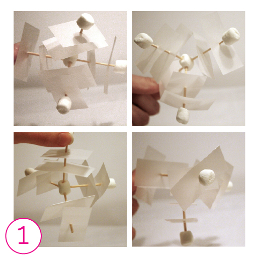
1) What if images could be categorized similar to a library; fiction, non-fiction, biography, etc?
What if each radial represents a different trusted source?

3d sketching_1

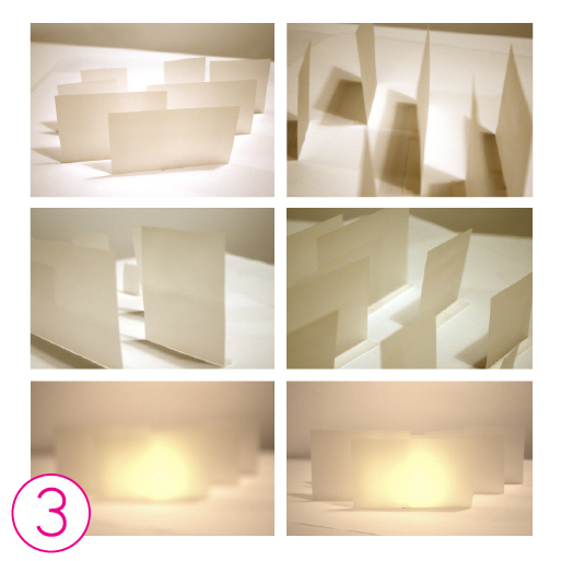
 2) What might a credible search feel like? Is it stiff and still or light and airy?

3d sketching_2

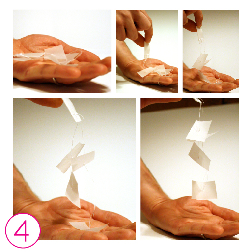
3) What if you could look behind an image to see more information, while still seeing other comparative images?
Does visual crispness imply something that blurriness does not?

3d sketching_3

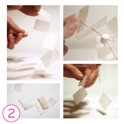
4) Could online searching be like digging through a pile of images tied together with strings?
Could you approach images from different angles to reveal additional information?

3d sketching_4

quick tips
• Turn off your computer
• Raid your kid’s craft box or the pantry
• Brainstorm WHILE making
• Reflect WHILE making
• Play with the ‘finished’ 3D sketch and reflect about the implied possibilities
• Talk about it with someone

Originally written for Parse.

Strengthen Your Design Process with Narrative

Designers often play the role of visual storytellers. We arrange visual elements creating narratives that resonate with our audiences. This ability to create narratives that capture attention and provide focus can be useful in our design process. Persona writing and scenario building are two narrative-based approaches that help designers model future use.

Personas Are Archetypes Of Your Audience
Creating personas allows you to build character models that move beyond demographics and address real audience motivations and goals. Persona writing should be based on research, rather than assumptions, to prevent you from projecting your own goals onto the audience. The research can be primary, like interviews or culture probes, or secondary like reviewing existing research. When building personas it’s best to develop two, or more, that embody different types of audience members, ex: an expert vs. a novice. An audience brings a range of motivations to a designed experience and developing multiple personas can help account for these differences.

You should always name your characters and create basic profile information for them like gender, age, ethnicity and profession. However, the really interesting, and useful, persona information comes from analyzing their interests, goals and motivations. Identifying why someone wants to engage with your design and what they want to get out of the experience suggests which qualities and functions to develop as you move through your design process. Ex: Lauren is a 30 year old stay-at-home mom that is self-employed. She values providing her kids with organic food, learning about food production, being empowered through gardening and building a sense of community around gardening issues. Students developed Lauren’s persona for Thrive, an online community that brings urban gardeners together. This type of values-based description moves far beyond “young, white and female” to address important audience motivations.

Process As Artifact
Persona development is good for collaborative projects as it allows complex audience motivations and goals to become clarified. Design artifacts created to display the persona traits can be shared in group spaces to keep the audience clear in mind. (Three cheers for process as artifact!) These artifacts can also be useful when attempting to discuss audience motivations with clients.

Personas Live On In Scenario Writing
Scenario writing can be useful both in the development phase of a project as well as the presentation phase. In the development phase, writing scenarios can be helpful in determining potential paths of user interaction as well as identifying user needs. Scenario writing makes use of narrative story structure to describe a specific user path. These narratives reveal areas of opportunity and potential gaps in your design that may lead to user frustration. Ex: When conceiving the functions of the Thrive community site, the designers might write a scenario around “Lauren” in which she needs to get information regarding problems with her home garden. This scenario development will point out problematic hurdles for the user and inform the design direction.

In the presentation phase, storytelling through scenarios can be very helpful when pitching complex projects to clients. They provide context of use and a personal story that will resonate and leave a meaningful impact. It centers project objectives around creating the conditions for a meaningful user experience.


Quick Tips 
1. Personas and scenarios are typically used in interaction and experience design, but can be applied to any designed artifact.

2. Just like a good novel draws us in, dynamic characters and plots can engage clients and create a memorable presentation.

3. Be cautious not to make assumptions. Personas and scenarios are only useful when based on real audience members and their motivations, goals and needs. Take time to create comprehensive characters and narratives.

Dig Deeper!
1. Check out Ideo’s Method Cards.
2. Read About Face 3: The Essentials of Interaction Design.
3. Review this in-depth look at scenarios, by Cady Bean-Smith, created as part of a collection of Design Thinking materials for the Cooper Hewitt.

Originally written for Parse.

Share Language: Design + Cartography = WOW

When cartographers make maps, they organize content according to relevancy, translate physical realities into visual representations and position elements to communicate messages. Designers appropriate these cartographic approaches and apply them to communication problems.

Mind Maps = Brainstorming
Mind maps are quick, low-stakes diagrams that help generate ideas, develop themes, create naming conventions and much more. A mind map is structured like a tree, with related ideas branching out from a single word or theme. Starting from the center, you add associated words freely as they come to mind. It works much like a visual thesaurus might, growing to include closely related, tangential and antithetical words. Mind maps are great for brainstorming at the onset of a project. The flat spatial organization prevents certain topics from looking more important; this lack of visual hierarchy keeps all ideas on a level playing field for the time being. The only anchor in the map is the beginning central word or theme.

Concept Maps = Visualizing Connections
Academic Joseph Novak introduced concept maps in the 1970s as a means to represent complex knowledge to students. They continue to be used in educational and creative contexts to visualize complex ideas and relationships. Unlike mind maps, concept maps utilize two main elements: nodes, which contain big ideas (written as nouns) and links (written as verbs) that connect ideas. When combined, the nodes and links create complete sentences within the map. This creates both a written narrative and a visual manifestation of the concept.

Concept maps allow big picture concepts and smaller connections to be viewed simultaneously. This means of externalizing concepts is helpful for team projects where all participants need to have a shared understanding of a complex problem. When working solo, concept maps can be a means of clarifying obscure connections and revealing unconsidered relationships. The structure of a concept map is not anchored by a central word, like in mind maps; this allows the designer to convey meaning through visual hierarchy. Formal choices help to define, and control, the reader’s entry point and experience of the map.

Eye Candy
Designers have long since incorporated rough diagrams into their processes, but recently the concept map has been elevated from process sketch to refined artifact. These maps require that you spend time with them and think critically about the content. They look pretty fab hanging in office spaces too. Beautiful and smart, what else is there?

quick tips
1) Match the map to your task. Do you need to quickly generate ideas and get out of a rut? Go with mind mapping. Need to clarify complex concepts at the problem solving stage? Go with concept mapping.
2) When creating mind maps, work quickly and freely. Let your associations flow and don’t make judgements. There is time for reflection when finished.
3) When creating concept maps, allow yourself plenty of time. Concept mapping requires a great deal of focus, critical thinking and reevaluation.

dig deeper
A Brief History of Mind Maps 
Great book that covers concept maps: Learning How To Learn by Novak and Gowin
Detailed Steps of How to Create a Concept Map by Dubberly Design
Eye Candy: Concept Map, The Creative Process by Dubberly Design, Jack Chung, Shelley Evenson, and Paul Pangaro.

Originally written for Parse


Reporting For Duty: Collaboration’s Biggest Fan.

Collaboration doesn’t come naturally to everyone. We all have our weaknesses, but unfortunately, or fortunately if you love working together like I do, our current design practice is increasingly collaborative. NC State College of Design Dean Marvin Malecha states, “While a romantic notion of the sole creative spirit lingers in the consciousness of the design profession, the increasing interdependence and interrelatedness of decision-making has ever been more apparent.” Other designers contribute value to the design process by providing creative perspectives, ways of knowing, and critical evaluations beyond your own. I push myself the hardest, and ask the toughest questions, when I know another designer, who I respect, will be working on the same problem. Collaborating can be the most rewarding type of work, but it doesn’t always come easy.

Be Honest and Clear
Clearly state what your expectations are in the collaboration at the outset. What do you expect to get out of it? How much time are you willing to contribute? What do you see as the primary objective? Together, agree on a shared goal and the steps that you will take to reach that goal. Problems can arise when one person veers off of the agreed upon path and there is no authority figure to mediate. Remember that your collaborator can’t read your mind, so you need to externalize those thoughts.

Tools for Externalizing
There are some simple tools for externalizing your thoughts in a partnership. Post-it note brainstorms can be a great, low stakes, method to generate a budding understanding of the project. Creating concept maps and mind-maps at the beginning of a project helps to visualize your shared goals. If you and your collaborator work in the same physical space, keep all of these externalizations up on the wall or posted to desks. This will serve a road map for your project.

Virtual collaborations are now easier than ever. Instant messaging programs like iChat are particularly powerful. iChat functions such as quick file sharing, video chatting, and screen sharing, efficiently facilitate virtual collaborations. Of course Google has great free tools as well — Google Docs allows you to share and edit a document online in real-time, while Google Presentation allows you to create a shared presentation. MindMeister allows you to create shared mind-maps online. There is no shortage of free tools, so choose what works best for you.

Seeking Partnerships
How do you find others willing to collaborate? I go back to the honesty factor. When you meet someone new, or overhear an interesting idea or project, spark up a conversation. Be direct and honest and ask if they would want to work together some time. More often than not, creative types will be inspired and activated by your inquiry.

quick tips
1) Don’t focus on the credit you will get from the contribution, focus on the process and artifact.
2) Be honest. With yourself and your collaborator. You don’t want to get into a project that isn’t what you intended.
3) Have fun and remain open. When you include other perspectives in your design process, you expand your own ways of seeing.

 dig deeper
More on concept maps by Rebecca Tegtmeyer
Collaborative Brainstorming
MindMeister
On Collaboration: Wikinomics: How Mass Collaboration Changes Everything
by Don Tapscott and Anthony Williams

See Some Collaborations in action, Layer Tennis

Originally written for Parse 

Be Selfish. Make Your Presentations Work For You.

As designers, we are often required to make public presentations, whether as initial client pitches, as progress reports on in-process work, or as formal talks at conferences. Typically, the goal is to educate or inspire audiences, but it is important to remember that there is value to the presenter in publicly discussing and sharing work. When forced to articulate your ideas to a group, your presentations can move beyond show and tell for the audience and allow you the opportunity to reexamine and refocus your ideas. A well executed presentation is a learning opportunity for both the presenter and audience. Presentations and feedback can become tangential even with dynamic public speaking skills. Approaching the creation of your presentation with some of the same strategies you might more commonly bring to a a design problem can help procure meaningful feedback.

Know Your Audience
Before beginning any presentation, spend time considering what the particular audience might offer you. Research your audience ahead of time and find out who will be attending your presentation. Are they experts, or novices, in a specific field? Are they currently working on a related project? You don’t want to talk down to, or talk above, your audience. If your audience is unfamiliar with some of your terminology, provide definitions. Designers love fancy phrases, but we often use them vaguely and inconsistently. For example, there is not just one accepted understanding of phrases like “systems thinking”, “design thinking”, “sustainability” or “media literacy.” Providing your working definitions and explaining any language specific to your project will familiarize the audience with your lexicon. [img 2]

Hierarchy
You can’t read, listen to, and process information at the same time, and neither can your audience. Your verbal and written communications should support each other, not create boring redundancies or confusing antitheses. If you don’t have an image that corresponds well with your verbal message find other ways to summarize your key speaking points on screen. The worst offense is to read a lengthy paragraph aloud and expect your audience to also read another piece of information on screen simultaneously.

Visually Engage Your Audience
Presentations don’t need to be overly jazzy, but utilizing basic design principles can prevent distractions created by poor form. Long column widths, tight leading and dense white text on black backgrounds are legibility issues on screen. Keep it simple and develop a basic grid in order to teach your audience where to look for certain types of reoccurring information.

Use Your Audience
Framing! Framing! Framing! Go back to basic writing strategies and develop an outline that focuses on the feedback you need. Guide your audience’s feedback by beginning with an introduction of the basic structure of your position and conclude with a summation of your main points and deductions. In order to direct the Q&A, clearly list your next steps or select key points from your presentation that you are interested in discussing.

Capture Feedback And Reflect
Hire a friend to take notes during the Q&A or record it with an iPod. This will allow you to fully focus on engaging in an insightful dialogue with your audience. Create a written reflection immediately following your presentation. Did you notice areas of improvement while presenting? Were new areas of investigation discovered? What relevant points were made by the audience? Lastly, if someone in the audience raised a particularly riveting point, pursue an individual conversation in another setting that will allow for a more organic conversation.

quick tips
1) Consider what each presentation context has to offer you and your agenda. What might you learn about your process, research and project from the particular audience? Even if you are delivering the same content, each context is different and poses a unique design problem.

2) Practice. Do an out-loud run through of your talk in advance of your actual presentation. It’s better to discover any potential sequencing or timing issues ahead of time in a low-stakes setting. Plus, the extra preparation might reveal an area of your project that you wish to expand upon, or revise, in the future.

3) Loosen up. The best advice I have ever received was from a professor who pointed out that nervousness and excitement feel a lot alike. Get excited to share your ideas!

dig deeper!
Speak Designers by David Barringer
I Do Declare by KT Meaney

Originally written for Parse.


Failure: It’s Not That Bad

Failure can be defined as a lack of success. But, how does one understand success within a creative practice? As a design educator, I witness fear of failing regularly. Whether a student striving for an A, a professor striving for tenure or a practitioner striving to build a practice we all have a fear of failing. However, what if the fear of failure and the accompanying baggage is worse than the failure itself?

Why is a fear of failure problematic?
Creative processes thrive on taking risks and trying new approaches. A fear of failing often leads to an anti-risk taking strategy. We feel safer playing it, well, safe and protecting ourselves from vulnerability. In a creative practice this doesn’t allow for innovation.

Dr. Brene Brown, a vulnerability researcher, points out that vulnerability is a source of anxiety and pain, but also a source for joy, creativity, love and belonging. She proposes that when we protect ourselves from being vulnerable, we not only block out anxiety and pain, but also the potential positive results, such as creativity; a pretty important aspect of design. A tight and prescriptive design process may help prevent error and imperfection, but it will likewise eliminate the potential for serendipity, delight and discovery.

Brown notes that seeking perfection is not the same as being driven. Of course, we want good grades, tenure, promotions, new clients, but can we allow ourselves room for potential “failures” as well? We can be driven while allowing for creative and intellectual exploration. If we continually play it safe, our work will not be innovative; it will become expected and irrelevant.

Sharing Failure
Remember that others are in your same situation, holding onto a fear of failing and attempting to protect themselves from vulnerability. The Failure Project is an online archive that works to share the common human experience of failing: “Too often in our schools, our workplaces, and our community organizations, failure is stigmatized to such a degree that students, teachers, artists, musicians, scientists, and innovators are unwilling to take risks in their intellectual and creative endeavors. This is the wrong attitude.” When we stop striving for perfection all of the time, and begin to embrace the knowledge and experience gained from failures, we will find more joy and success in our practices

Privilege The Possible Over The Predictable
Design is an inherently vulnerable act: creating something out of nothing and putting that out into the world. Acknowledge that failures, large and small, are a built-in aspect of the design process. Empower yourself to continue creating and sharing from this place of vulnerability. Try something and if it fails, mine your missteps for useful information. When we critically examine our failures, we will find them to be just as valuable and instructive as our successes.

quick tips
1) Remind yourself that failing is not the end of your career; focus on what you’ve learned and can apply to your next project.
2) Be comfortable with vulnerability in your creative process: “Anything I’ve ever done that ultimately was worthwhile, initially scared me to death. — Betty Bender”
3) Share your experiences. A close friend or colleague may shed light on aspects of success that you have overlooked while focusing on the failure. Also, you may inspire others by openly sharing your failures.

dig deeper
The Failure Project
Dr. Brene Brown at TEDx
Dr. Brene Brown
Getting Comfortable With Failure

Originally written for Parse

This essay was included in the project Failing Forward “an experiment in critical design, focusing on the concept of failure as a starting point for success.” My essay can be found on their website, with a print publication following shortly.

Exploring the Typographic Wild West

As graphic designers we have been thoroughly trained to finesse typography. We painstakingly analyze each line break, each dash, each quotation mark. We consider it a point of pride to scoff over “type crimes.” We are obsessed. With typography. In print.

Web typography is another story. Typography on theweb is the wild west of design. Old laws are unenforced, our designer control goes out the window, and we are left floundering. How do such control freaks adapt to this environment?

Typography as Interface
Many of the same principles that we use in print apply to the web, just in different ways. In print, our typographic decisions direct the readerʼs experience. Similarly, online typographic hierarchy operates as interface, letting your audience know where they are and where they can go. When you design with a limited range of typefaces and styles, your audience can more easily learn your set of interactive rules and understand how to navigate. Be distinct in your decisions; if the shifts in your type treatments are too subtle to indicate different kinds of information, something like an active link may go unnoticed and leave your audience lost.

Does it make your eyes hurt?
Reading on screen is a bit harder on the eyes, so to improve legibility allow for more generous leading, reduce contrast levels and choose an appropriate typeface. Contrast levels are critical. While white type on a black background in print may work just fine, on screen it creates too much tension and strains the eyes. Try shifts in tonality, working with shades of gray. When choosing a typeface, itʼs best to look for open counters, subtle shifts in stroke weight and sturdy serifs.

Finding beauty within limitations
Web-safe typeface options have been limited. MacArthur fellow and type designer Matthew Carter has provided us with two of the best options: Georgia and Verdana. Trebuchet and Palatino are nice legible options too. I think we can skip the discussion on why Comic Sans, Impact, and Lucida are poor choices. Times New Roman may be widely used on the web, but it was originally designed for use in a newspaper. Newspapers and websites are not the same contexts. Selecting a typeface and setting the type based on the context of use provides a solid foundation for design decisions. So, even if you are building a website using Flash and donʼt have to worry about selecting web-safe type, you still need to consider the other factors that contribute to a comfortable screen-based reading experience.

The Future
With new technologies like @font-face and Cufon, more (selectable text!) type options for the web are coming our way. These technologies essentially allow you to stream fonts to the users and break the reliance on usersʼ system fonts. This gives designers more of control back, and allows us to formally execute our concepts without so many restrictions. This new found freedom wonʼt come without some caveats. Just because you can now use Bodoni online, doesn’t mean you should.

Quick Tips
1. Never forget the context. Websites are not printed. Beautiful, delicate, teeny tiny serifs will never work on screen.
2. Text type should be read comfortably. Try reading your own screen type at length and reflect on the experience.
3. Where Am I? Typography online operates as navigation. Help your audience know where they are and guide them to their next destination.

Dig Deeper!
Bringhurst Applied to the Web

Pairing Typefaces For The Web

Color Contrast Checker

Type Testerhttp

@font-face

Cufon

The Politics

Originally written for Parse. 

Convey Your Interactive Concepts

Interaction designers are not web developers and should not be expected to take on the role of development. Developers are experts in what they do, which allows us to be experts in what we do: creating the conditions for meaningful user experiences.

While the proposition of a clear division of roles may be controversial with some, it is becoming increasingly unrealistic for designers to execute all aspects of a project. There is just too much complexity. Interaction design projects can encompass content management systems, multiple platforms and user contributed content, among other factors. Developers know how to build support systems and execute a designer’s vision, much like an offset printer brings life to a printed artifact. In order for the relationship between designer and developer to function and flourish, we must know how to communicate our vision and be experts in designing online experiences.

Expert Coder ≠ Interactive Designer
You do not need to be an expert coder to be a great interactive designer. This is particularly important to understand if you desire a transition from designing primarily for print, to designing for screen based experiences. Focus on understanding how to create meaningful non-linear user experiences. This understanding hinges on audience research, applying typography and form appropriate for the screen, considering multiple platforms (i.e. mobile, tablet, desktop hub) and creating refined clear hi-content wireframes.

Know The Conventions & Then Push
While we don’t need to know extensive coding language, we do need to have a basic understanding of the means of production. When we design for print, we know what industry conventions and standards to follow. When designing for the screen it’s equally important to be aware of industry conventions. Designers often push printers and developers beyond what they think is realistic or possible. This may result in a challenging production planning phase, but the testing of such boundaries is a critical part of innovation. When designing screen based experiences, push up against one or two conventions at a time, and observe key industry standards to preserve credibility with your developers and clarity with your user.

Convey Your Concept
In addition to creating comprehensive static wireframes, animated prototypes allow designers to convey interactive concepts to clients and developers. iWork’s Keynote is a robust and easy to use software tool for demonstrating the role motion and interaction play in interaction design. Simulating motion (whether roll over states or transitions) may help identify moments you’ve overlooked, but that are critical to the user experience. Animated prototypes can provide the foundation for a richer conversation between designer and developer.

While we don’t need to know extensive coding language, we do need to have a basic understanding of the means of production. When we design for print, we know what industry conventions and standards to follow. When designing for the screen it’s equally important to be aware of industry conventions.

Quick Tips 
1. Don’t be intimidated by the software or coding languages. Focus on creating meaningful user experiences and leave the building to the developers.
2. Learn the industry vocabulary in order to communicate concepts.
3. Be aware of industry conventions in order to plan a successful project.

Dig Deeper!
1.Read Jesse James Garrett’s Elements of User Experience.
2. For more on communicating interaction design concepts read this Parse post: “Strengthen Your Design Process With Narratives.”

Originally written for Parse

True Sustainability: A Way of Being

We love to do good. The design community is increasingly engaged with doing work for good and embracing do-goodery. This is manifesting is several ways: following sustainable practices, supporting communities and organizations that need assistance, raising awareness about the benefits of socially minded design, etc. In tough economic times, our well intentions may move to the back-burner as we struggle to make ends meet, but how can we continue to do good?

Make It A Priority
Making do-goodery a priority for your business will have long-term payoff. Obviously, it will leave the earth in better shape, but it will also position you as part of a thoughtful, forward thinking group. If you strive to be an example to your clients by the way you respect the world, they will begin to respect you for your leadership and commitment.

The Basics
We should all be doing the basics in our design practice. Using soy based inks and recycled paper, supporting paper mills that make sustainable practices a priority, and articulating the value of these choices to our clients. Recycling all studio materials should be second nature by now, but making this process visible in your studio can make you an advocate. Use your experts; work with your printers and paper reps to stay up on the new innovations in sustainable practices.

Pro-Bono means ‘for good’
Ric Grefe, the executive director for AIGA, recently stated that pro-bono doesn’t have to mean for free; it can mean for good. Strive to do work worth doing. Think of this broadly; it shouldn’t be limited to the equivalent of the ‘save the rainforest’ poster. Step outside of your normal client zone and seek out organizations that could use your design thinking skills for good. On a large scale, we’ve seen this through projects like Design for Democracy, and on a smaller scale, organizations like Design Ignites Change seek to financially support projects. The design world is rewarding, and recognizing, work worth doing via competitions like cause/affect and AIGA (re)design. The support from our community is there, so take advantage of it.

When should you just say no?
So, you’ve covered the basics and strive to supplement your practice with socially minded projects. What more can you do? Ask yourself if an artifact is appropriate or if you should you just say no. The Audience Receptivity Gradient, created by David Rose, is a great tool for making sure you are appropriately targeting audiences. There is nothing more wasteful than creating an artifact that is incorrectly tailored and distributed via a misaligned channel. Ask the critical question: is your client’s message appropriate to their audience? In the Audience Receptivity Gradient, audiences are plotted in one of five places: not ready to know, ready to know, ready to hold and opinion, ready to act and ready to advocate. When devising a communication plan, the goal is typically to move audiences forward one or two steps, but no more. Realizing this, and articulating it to your client, can result in smaller, more targeted communication strategies. For example, if your client wants to notify consumers about a new service, is a printed brochure the best approach or would a viral campaign be more appropriate? While it may be hard to turn away work, especially in an economic downturn, you are doing your clients a disservice, and wasting resources, by letting them pursue a communication plan that isn’t going to succeed. Clients may continue to request traditional/expected design solutions (ie: we need a poster! A billboard! 100,000 brochures!), but it is the domain and the responsibility of the designer to determine the best vehicle for the client’s message. The mindful designer may then possibly suggest an interaction or service design solution with a lighter environmental impact and a more direct appeal to the audience.

In the Audience Receptivity Gradient, audiences are plotted in one of five places: not ready to know, ready to know, ready to hold and opinion, ready to act and ready to advocate. When devising a communication plan, the goal is typically to move audiences forward one or two steps, but no more. Realizing this, and articulating it to your client, can result in smaller, more targeted communication strategies.

Quick Tips 
1. Must do the basics: recycle, use recycled materials, support vendors with sustainable efforts.
2. Be an example to your clients by the way you respect the world.
3. Ask the right questions and be prepared to just say no.
4. Push yourself to do better. Do one new thing to help our planet and communities every day or week or month or year. Whatever works for you.

Dig Deeper!
1. AIGA’s Living Principles
2. AIGA’s Design for Good Initiative
3. Design for Democracy
4. Design Ignites Change
5. Cause/Affect
6. (re)designAwards
7. SustainableAble: A Handbook of Materials and Applications for Graphic Designers and Their Clients

Originally written for Parse