As graphic designers we have been thoroughly trained to finesse typography. We painstakingly analyze each line break, each dash, each quotation mark. We consider it a point of pride to scoff over “type crimes.” We are obsessed. With typography. In print.
Web typography is another story. Typography on theweb is the wild west of design. Old laws are unenforced, our designer control goes out the window, and we are left floundering. How do such control freaks adapt to this environment?
Typography as Interface
Many of the same principles that we use in print apply to the web, just in different ways. In print, our typographic decisions direct the readerʼs experience. Similarly, online typographic hierarchy operates as interface, letting your audience know where they are and where they can go. When you design with a limited range of typefaces and styles, your audience can more easily learn your set of interactive rules and understand how to navigate. Be distinct in your decisions; if the shifts in your type treatments are too subtle to indicate different kinds of information, something like an active link may go unnoticed and leave your audience lost.
Does it make your eyes hurt?
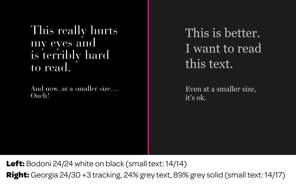
Reading on screen is a bit harder on the eyes, so to improve legibility allow for more generous leading, reduce contrast levels and choose an appropriate typeface. Contrast levels are critical. While white type on a black background in print may work just fine, on screen it creates too much tension and strains the eyes. Try shifts in tonality, working with shades of gray. When choosing a typeface, itʼs best to look for open counters, subtle shifts in stroke weight and sturdy serifs.

Finding beauty within limitations
Web-safe typeface options have been limited. MacArthur fellow and type designer Matthew Carter has provided us with two of the best options: Georgia and Verdana. Trebuchet and Palatino are nice legible options too. I think we can skip the discussion on why Comic Sans, Impact, and Lucida are poor choices. Times New Roman may be widely used on the web, but it was originally designed for use in a newspaper. Newspapers and websites are not the same contexts. Selecting a typeface and setting the type based on the context of use provides a solid foundation for design decisions. So, even if you are building a website using Flash and donʼt have to worry about selecting web-safe type, you still need to consider the other factors that contribute to a comfortable screen-based reading experience.
The Future
With new technologies like @font-face and Cufon, more (selectable text!) type options for the web are coming our way. These technologies essentially allow you to stream fonts to the users and break the reliance on usersʼ system fonts. This gives designers more of control back, and allows us to formally execute our concepts without so many restrictions. This new found freedom wonʼt come without some caveats. Just because you can now use Bodoni online, doesn’t mean you should.
Quick Tips
1. Never forget the context. Websites are not printed. Beautiful, delicate, teeny tiny serifs will never work on screen.
2. Text type should be read comfortably. Try reading your own screen type at length and reflect on the experience.
3. Where Am I? Typography online operates as navigation. Help your audience know where they are and guide them to their next destination.
Dig Deeper!
Bringhurst Applied to the Web
Originally written for Parse.