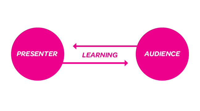
As designers, we are often required to make public presentations, whether as initial client pitches, as progress reports on in-process work, or as formal talks at conferences. Typically, the goal is to educate or inspire audiences, but it is important to remember that there is value to the presenter in publicly discussing and sharing work. When forced to articulate your ideas to a group, your presentations can move beyond show and tell for the audience and allow you the opportunity to reexamine and refocus your ideas. A well executed presentation is a learning opportunity for both the presenter and audience. Presentations and feedback can become tangential even with dynamic public speaking skills. Approaching the creation of your presentation with some of the same strategies you might more commonly bring to a a design problem can help procure meaningful feedback.
Know Your Audience
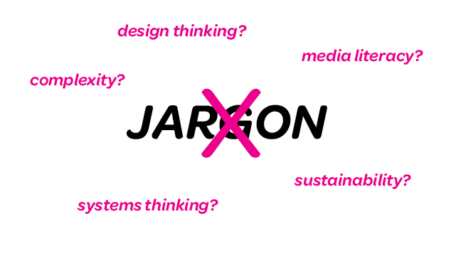
Before beginning any presentation, spend time considering what the particular audience might offer you. Research your audience ahead of time and find out who will be attending your presentation. Are they experts, or novices, in a specific field? Are they currently working on a related project? You don’t want to talk down to, or talk above, your audience. If your audience is unfamiliar with some of your terminology, provide definitions. Designers love fancy phrases, but we often use them vaguely and inconsistently. For example, there is not just one accepted understanding of phrases like “systems thinking”, “design thinking”, “sustainability” or “media literacy.” Providing your working definitions and explaining any language specific to your project will familiarize the audience with your lexicon. [img 2]
Hierarchy
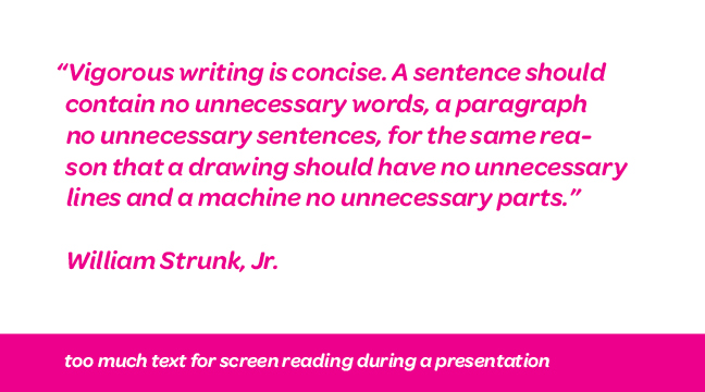
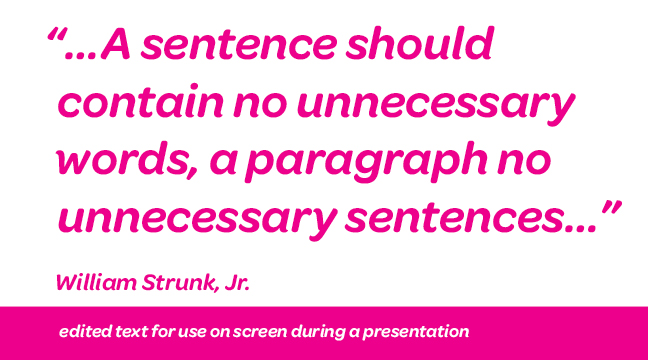
You can’t read, listen to, and process information at the same time, and neither can your audience. Your verbal and written communications should support each other, not create boring redundancies or confusing antitheses. If you don’t have an image that corresponds well with your verbal message find other ways to summarize your key speaking points on screen. The worst offense is to read a lengthy paragraph aloud and expect your audience to also read another piece of information on screen simultaneously.
Visually Engage Your Audience
Presentations don’t need to be overly jazzy, but utilizing basic design principles can prevent distractions created by poor form. Long column widths, tight leading and dense white text on black backgrounds are legibility issues on screen. Keep it simple and develop a basic grid in order to teach your audience where to look for certain types of reoccurring information.
Use Your Audience
Framing! Framing! Framing! Go back to basic writing strategies and develop an outline that focuses on the feedback you need. Guide your audience’s feedback by beginning with an introduction of the basic structure of your position and conclude with a summation of your main points and deductions. In order to direct the Q&A, clearly list your next steps or select key points from your presentation that you are interested in discussing.
Capture Feedback And Reflect
Hire a friend to take notes during the Q&A or record it with an iPod. This will allow you to fully focus on engaging in an insightful dialogue with your audience. Create a written reflection immediately following your presentation. Did you notice areas of improvement while presenting? Were new areas of investigation discovered? What relevant points were made by the audience? Lastly, if someone in the audience raised a particularly riveting point, pursue an individual conversation in another setting that will allow for a more organic conversation.
quick tips
1) Consider what each presentation context has to offer you and your agenda. What might you learn about your process, research and project from the particular audience? Even if you are delivering the same content, each context is different and poses a unique design problem.
2) Practice. Do an out-loud run through of your talk in advance of your actual presentation. It’s better to discover any potential sequencing or timing issues ahead of time in a low-stakes setting. Plus, the extra preparation might reveal an area of your project that you wish to expand upon, or revise, in the future.
3) Loosen up. The best advice I have ever received was from a professor who pointed out that nervousness and excitement feel a lot alike. Get excited to share your ideas!
dig deeper!
Speak Designers by David Barringer
I Do Declare by KT Meaney


