Creating Tailored and Tailorable Communication Experiences
Head, Heart, Hand, AIGA National Conference. Minneapolis, MN. Oct 2013. Presenter of pedagogical model and case studies.
Abstract developed collaboratively with Jamie Gray
‘Tailoring communication experiences’ is an undergraduate project run as a cross-studio, collaborative learning environment that spans three phases including design research, tailored visual communication and tailorable mobile applications. The learning outcomes aim to prepare students for professional practice that address context and audience; to expand student’s understanding of designing for niche audiences by considering needs, values and obstacles; and to provide the next generation of designer’s with the tools to be thoughtful problem solvers, rather than creators of isolated artifacts.
Introducing user research at the undergraduate level leads students to discover and define the design problem themselves. This open approach reveals symbolism and obstacles about the audience, and creates conditions for meaningful experiences in the applications. Direct contact with the audience creates an empathetic connection between designer and content (past years ranged from roller derby girls and urban chicken farmers to urban cyclist and marathon runners). Students work collaboratively towards an understanding of user motivations and goals that move beyond demographics, then visualize the research in a well crafted book.
Research is applied in two concrete applications, one of which is tailored visual communication and the other is tailorable interaction design. (1) Students propose and develop an engaging communications strategy in which the call to action, visual messaging and choice of channel are appropriately tailored. (2) Students create a smartphone app that assists the user in overcoming identified obstacles while tailoring their experience. The resulting outcomes span print and screen based media (past years have included food truck branding and road safety campaigns to fashion inspiration and civic resource apps).
We would like to present the details of this project, and examples, to other educators in hopes of providing a path to creating educational experiences that allow for user research at the undergraduate level, designing cross media systems and successful collaborations.
Presentation
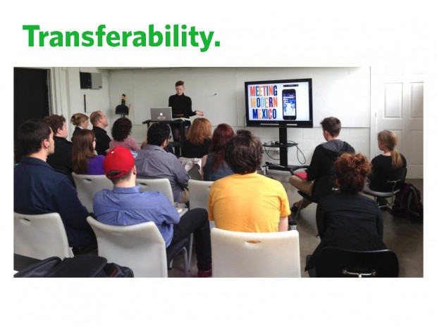
Today, I’ll present the details of a cross-studio collaborative project that I currently teach a version of at KCAI.
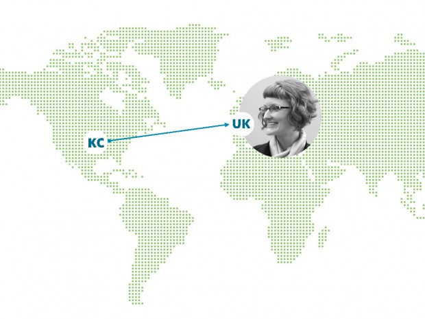
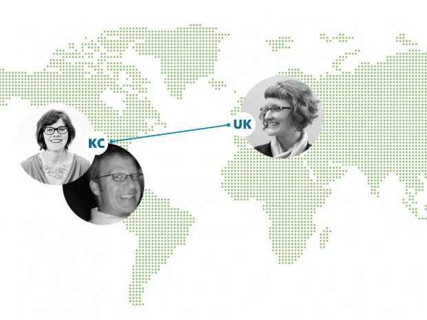
First, I have to say that my original project collaborator, Jamie Gray, left KCAI last year to move to London. Despite her departure, this project has lived on (in part) and I have learned a lot about transferability that I’ll share at the end of the presentation.
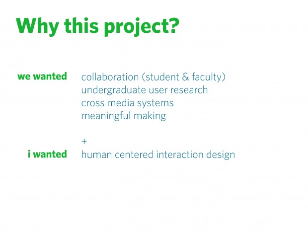
So, why this project? In the beginning, we wanted a project that: taught collaboration and allowed us to collaborate / got undergraduates started in the research world / encouraged students to think about cross media systems / and encouraged meaningful, research based, form-making. I wanted to be able to teach human centered interaction design that addressed specific user needs, but had to do it in the time allowed in a 15 week semester, when I also have to cover concepts like scenarios, sitemaps, wireframes, and interface best practices. The only way for me to be able to accomplish all of this in a comprehensive way, was to partner with another class.
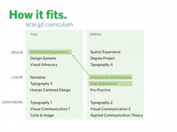
This project took place in the spring semester of the junior year, in UX and IA. While we try to avoid media silos at KCAI, we do have two classes dedicated to interaction design and I’m currently responsible for them and their scaffolded curriculum. IA prepares students for the senior course MX.
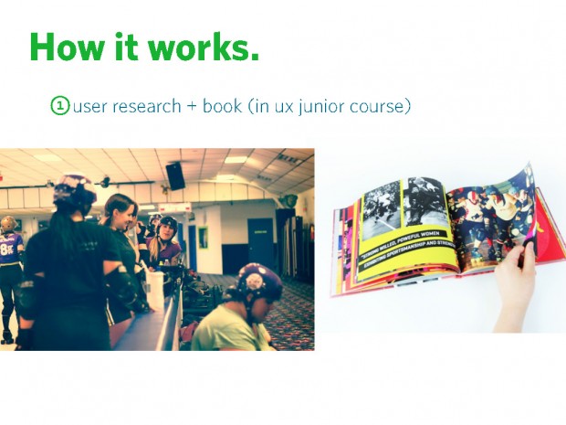
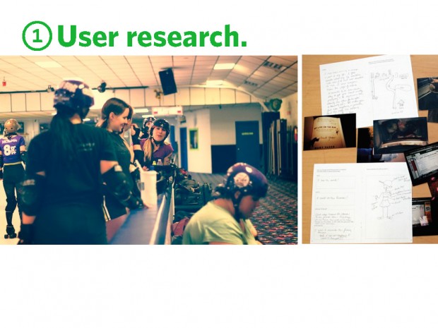
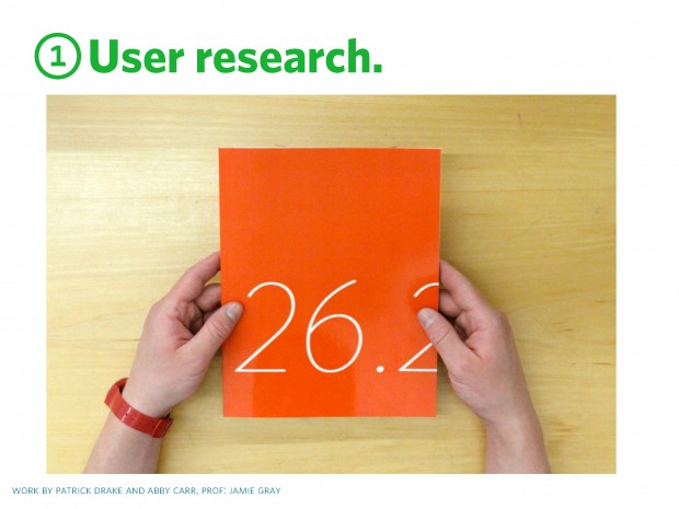
This project starts in UX, where students are put into teams and select a sub-culture. Some examples: Urban Chicken Farmers, Roller Derby Gals, Female Coders, Marathoners, Harley Enthusiasts, etc. They do in depth research of the culture and write and design blurb books that document their learnings.
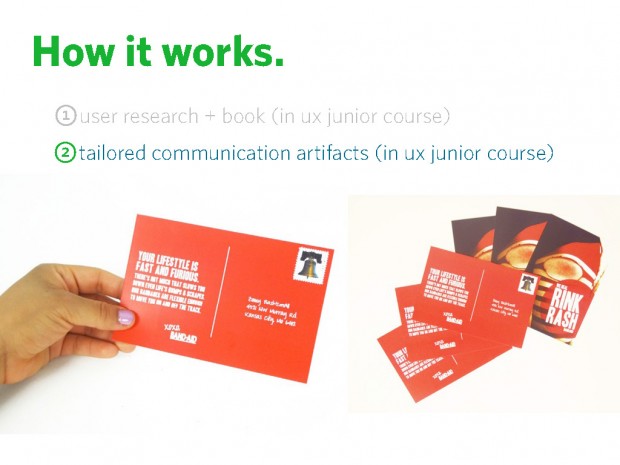
Next, still in UX, they take their findings and apply them to create a tailored communication campaign that addresses an identified need.
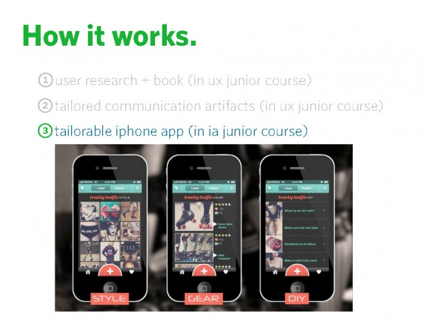
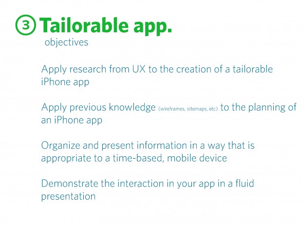
Lastly, now in IA, they either continue working with their selected sub-culture or select another classmates research. They create a tailorable iphone app that addresses an identified need/goal or obstacle. If they opt to design for another sub-culture, it is a great way to test the research done by their classmates. Was the research comprehensive and was the book designed in a way that is usable?
This project idea was inspired by an article by Kathy McCoy, Maximize the Message: Tailoring Designs for Your Audience, How Magazine, July/August 1999. In which she states: “Each interprets a message as part of a community, each audience member also responds as an individual. These parallel identities suggest two design strategies: tailored communication, in which a message is targeted to a community’s characteristics; and tailorable communications, in which a message can be customized by the individual to fit her unique needs and preferences.”
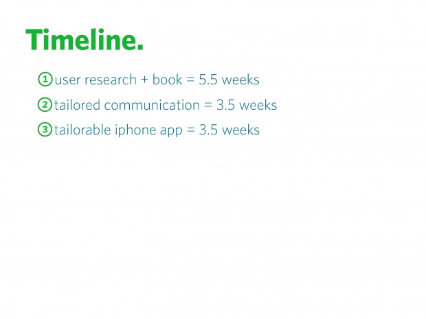
Students work collaboratively for 5.5 weeks on the research, then work independently on the other two steps.
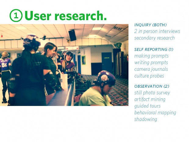
K McCoy defines that we are in “era of the audience” in which receivers are most important. And that we have moved past undifferentiated audiences and looking instead to an increase of subcultures and special interest groups. While this now, so many years after the rise of Modernism, seems obvious, it still seems difficulty to move beyond demographics. So, we feel that it’s Important to get students thinking beyond demographics early on. Working in pairs, students are required to carryout both first and second hand research. They are required to do: in person interviews / secondary research select one self reporting method: making prompts / writing prompts / camera journals / culture probes and select two observation methods: still photo survey / artifact mining / guided tours / behavioral mapping / shadowing
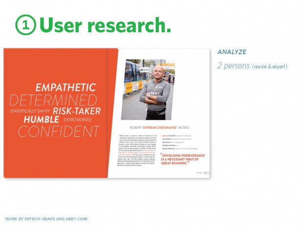
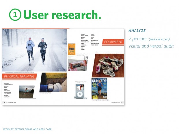
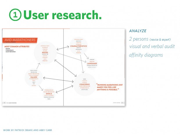
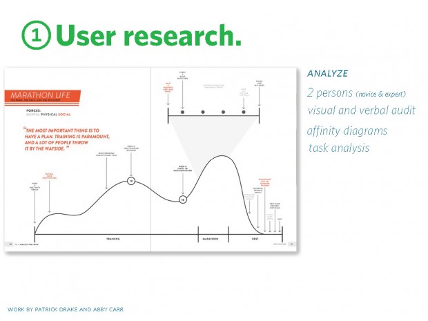
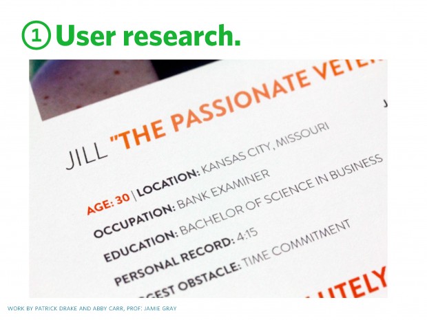
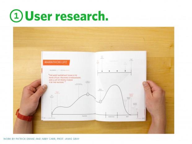
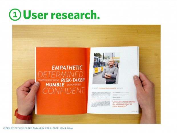
now, still working in teams, they analyze their findings in these ways: the creation of two personas (e.g. novice & expert) / visual & verbal audit (aka communication codes) / affinity diagrams (values, traits, goals) / task analysis (behaviors, obstacles, decision points)
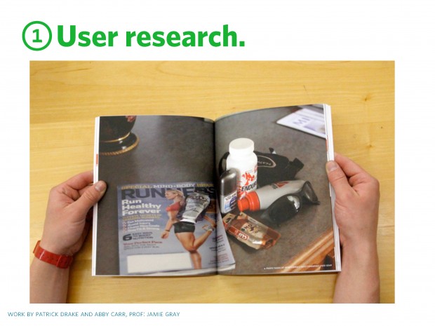
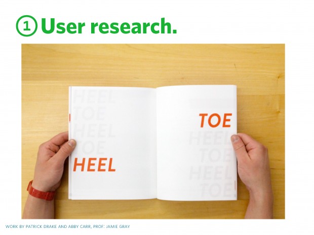
These were then compiled into the design of a blurb book. In some cases, their classmates would use these later in the IA tailorable app project. Here work by Patrick and Abby.
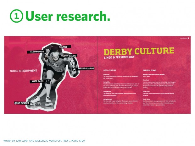
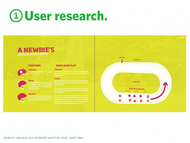
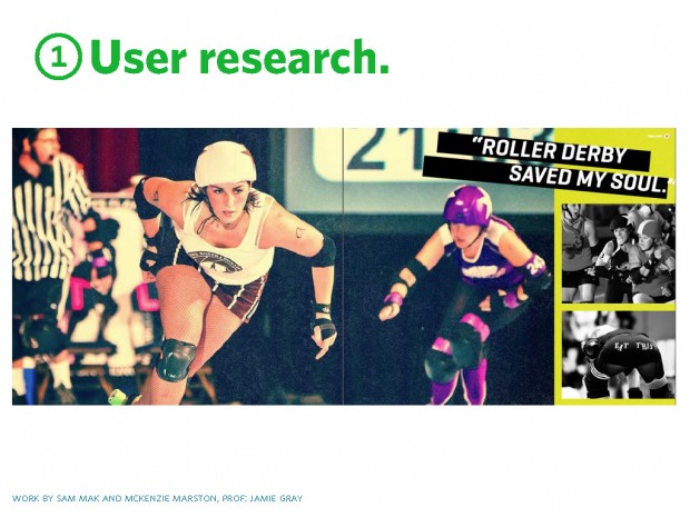
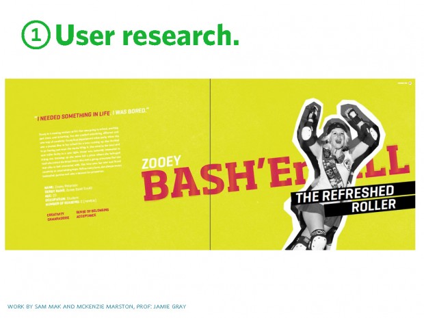
another example, here for the Roller Derby community by Sam and McKenzie. So, important to note that there is a lot of visual form making happening in this research project, along with strategy and writing. No need to look at making and research as opposing forces.
now working individually, they work to design a persuasive and tailored advertisement – for a product, service or cause– that is targeted to their sub-culture. the objectives: Synthesize research and analysis from project 1 (apply findings from research book) / Select an appropriate product, service or cause to promote to the niche audience / Propose and design an engaging tailored communications strategy (including messaging, look and feel, and intended channels)
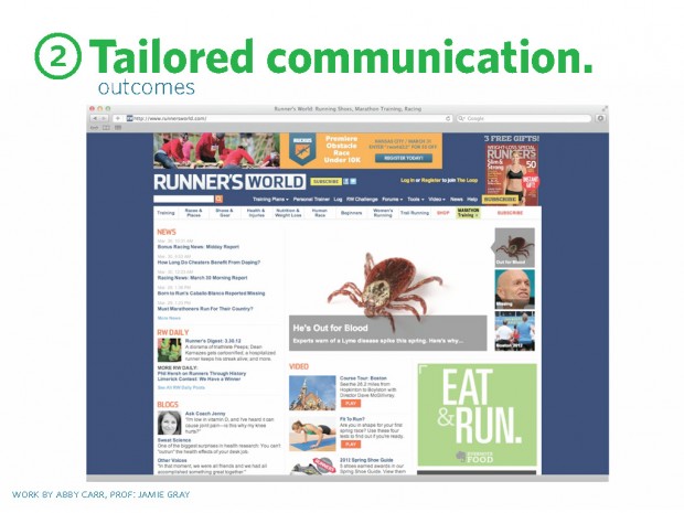
Abby (who researched and designed for marathoners) identified that healthy diet and lack of time were core concerns of marathon runners. She identified a helpful diet/scheduling app (Eat & Run) that was not currently being marketed to this audience. The online banner ads are placed on websites frequented by runners. The ads link to a microsite with messaging that emphasizes the ease and speed of tracking meals in an everyday training regime.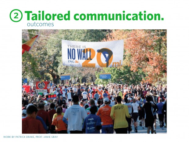
Here are Motivational banners designed by Patrick Drake for Avid Marathoners. The banners targeted a runner’s need for motivation at the 20 mile marker — a common obstacle referred to as “the wall” — and employed it metaphorically as a means towards financial achievement with the race sponsor, ING.
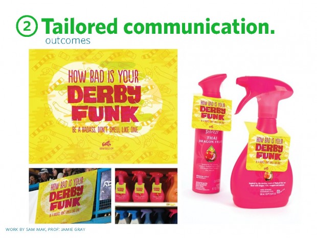
Here, Sam explored how tailored language, imagery and color palette, can transform a generic product into one that suites a specific sub-culture, such as Roller Derby girls. Evoking language like “How bad is your Derby Funk. Be a Badass, don’t smell like one.” and using the bright color palate speaks directly to derby culture.
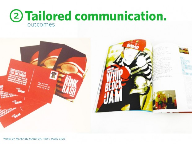
Here, McKenzie, used coded language like “Whip/Block/Jam and Rink Rash to speak to the Roller Derby sub-culture. If I saw this in the mail, I wouldn’t be totally clear on what Rink Rash was, but that’s beside the point, it’s not targeted to me.
according to the k. mccoy article, tailorable artifacts can be non digital, but iphone apps provide a great opportunity and we have the need to address apps in our curriculum. the primary goal is to allow users to customize the app based on needs, goals and skills, identified in the research phase.
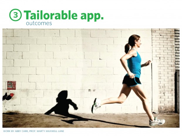
Here, Abby (continuing her work with Marathoners) created Tempo Train, (video) an app which allows training marathoners to create customized playlists based on their running pace. The task analysis completed during the research phase identified obstacles that users face, here waning motivation during training.
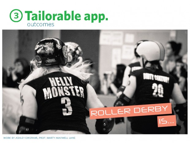
Here, Ashley (now working with another group’s research book), created Brawley Boutfits, which allows Roller Derby users to find inspiration for outfits by tailoring the experience to their derby style or look for specific gear. (video)
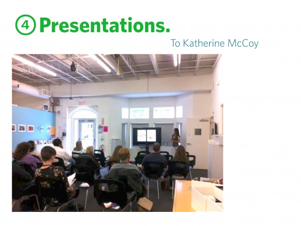
the first year we taught this project, we invited kathy mccoy to come an end of semester presentation, where we asked students to reflect and synthesize this process. this was a great opportunity to get feedback from the author of the article on which our project was based. it also forced students to reflect on what they’d learned. as educators, we’ve learned that it’s sometimes more meaningful to have students present what they learned in the project vs just showing the final project artifact.
so, as i mentioned my partner in crime moved to the UK. so, what do you do when you’ve done all of this work to come up with a collaborative project and then 1/2 of the team leaves? how do you salvage the work? I reworked it, keeping what I could for my course, Info Arch. The UX course and overall course objectives remained the same, but at KCAI, we have a flexible curriculum that allows tenured professors to modify projects as they see fit. So, with a new faculty member came new projects, with the exception of one.
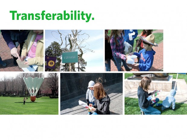
The remaining project in UX, is one in which students work with The Nelson Atkins Museum of Art to create an analog map and fun accompanying materials for kids to navigate the museum’s sculpture park. The students research appropriate age groups and carry out a user testing day with area kids. Kids and their families come for an entire day of testing and feedback. While the user research portion is now different, I still saw this as a great opportunity to create another crossover project with IA. What if students in IA could create apps tailored to kids and/or families visiting the sculpture park?
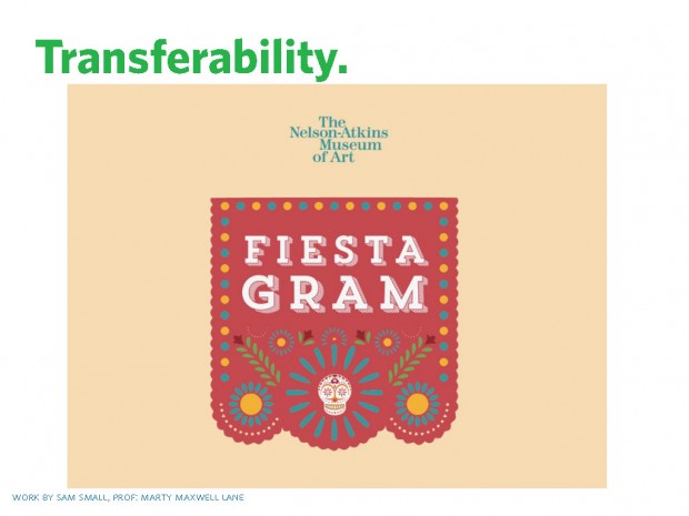
What I landed on was for students in IA to create an app that was tailored to either kids or families that frequent the Nelson. During this time, the Nelson had a visiting Modern Mexico exhibition and they were creating a special event, Fiesta in the Park, to bring families to the Nelson and the sculpture park. You are about to see work by Sam Small, where he created an app that allowed kids to create fun collages while providing incentives for the kids to visit each sculpture. (video) The results from this project aren’t the always allowing the audience to customize their experience (ie. aren’t tailorable), but my emphasis this first go-round with the new cross-over model was for them to create app that were tailored based on meaningful user research.
reminder, that i am only a part of the team. much thanks to jamie gray for her teaching collaborations over the years. and much thanks to michael kidwell for his new partnerships in UX.
